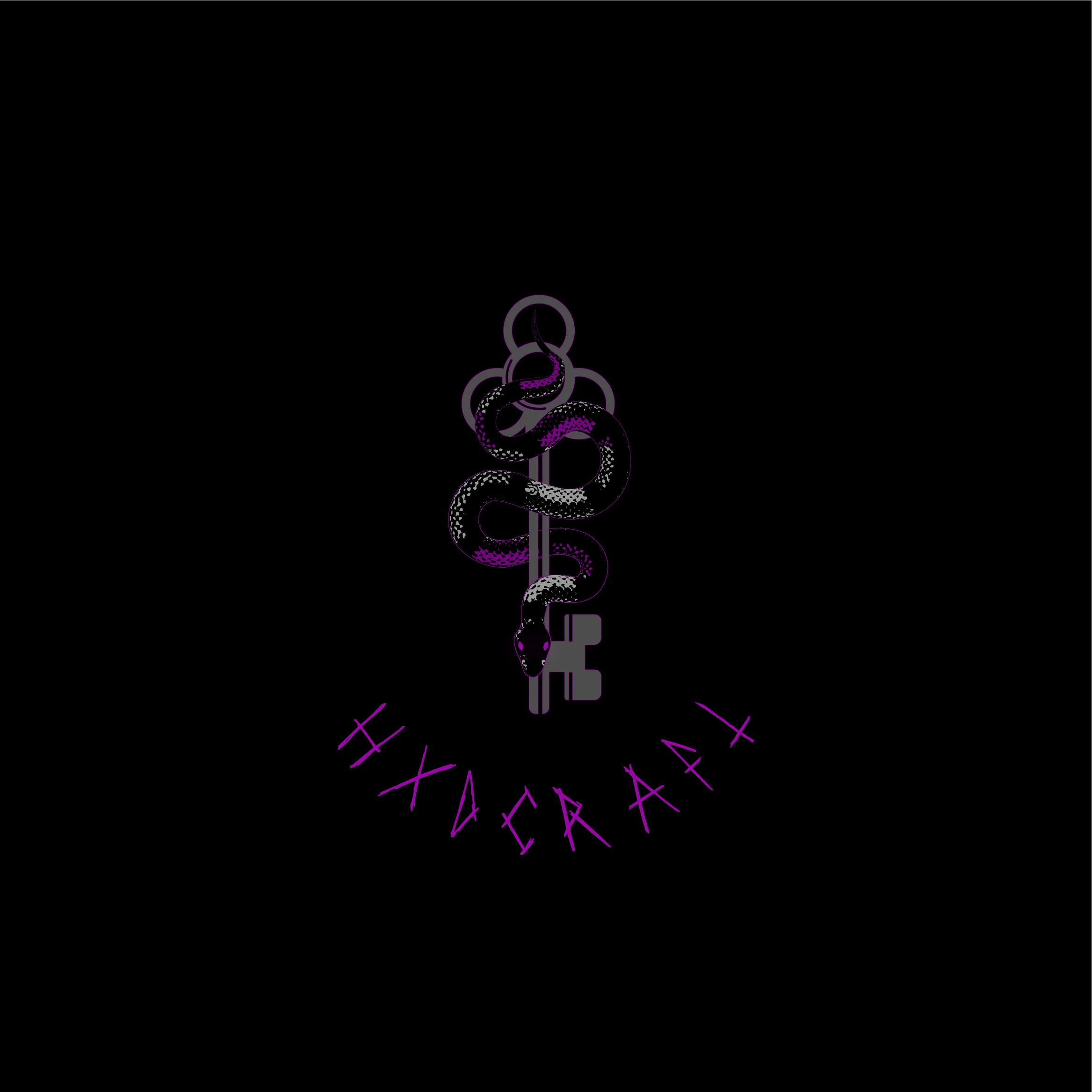
Close up details.
I was lucky enough to work with such an awesome client Christa, at @HXDCRAFT. Christa was a designers dream, who gave feedback and had creative ideas of her own, that really fleshed out the logo to be what it became. I was given to main goals for this logo:
A serpent.
A 3 hole key.
The serpent to have red eyes ( which later turned purple)
I did a lot of visual research for this logo. I looked at a lot of 3 looped keys, but my goal was to not have the key the focal point, but the snake around the key. I wanted the key to be solid, but still have character so I cut out shaped to add a bit of dimension.
Reduced size logos.
Early Concepts
Early versions of the logo, I worked in a lot of red to add contrast, which later turned to purple by my client sending me a swatch of purple to try. The purple really adds a nice contrast to the logo itself and I am so glad the client had the idea to try it.


